Subscribe to:
Post Comments (Atom)
skip to main |
skip to sidebar


Proud to be a Certified Zentangle Teacher!

Zentangle Bags Pages 32-35

4 PAGE SPREAD ON MY SCRAPPY CHIC RECYCLED QUILT AND DOILY BOOKS

See my tote and article on p. 132.
_md.jpg)
This is the one with the Birds of a Feather covers, pags 66-69.

Find samples from a collaborative chunky book I hostessed which includes my page for letter S on p. 100.


About Me

- jane eileen
- I'm a middle sister from a librarian mom and artist dad, also an artist, CZT, designer, fiber arts and mixed media instructor, school teacher, tia, friend, proud mother of 2 extraordinary daughters and Nona of 2 A+mazing grandwonderfuls. My blog text, photographs, and design work is © Jane Eileen and for inspiration only, not be copied for profit, publication, or contest submission without my explicit permission. Thanks, Loves!

Proud to be a Certified Zentangle Teacher!
Visit my etsy shop! Click on any photo.
Classes and Appearances
Watch here for updated informaion as it becomes available.
Save
PLACES WHERE MY ARTWORK HAS BEEN PUBLISHED
Haute Handbags Spring 2014

Zentangle Bags Pages 32-35
ARTQUILTING STUDIO SUMMER 2013

4 PAGE SPREAD ON MY SCRAPPY CHIC RECYCLED QUILT AND DOILY BOOKS
Haute Handbags Spring 2010

See my tote and article on p. 132.
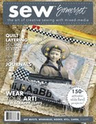
Sew Somerset Winter 2010
_md.jpg)
This is the one with the Birds of a Feather covers, pags 66-69.
Somerset Studio Gallery Winter 2010

Find samples from a collaborative chunky book I hostessed which includes my page for letter S on p. 100.
Sew Somerset Summer 2009
Haute Handbags Volume 2
The Crafty Diva's D.I.Y. Stylebook by Kathy Cano Murillo
Blog Archive
-
▼
2013
(48)
-
▼
May
(16)
- Diva #118 and Bright Owl # 59
- Ebony and Ivory
- Zendala Dare #58
- Intermediate Zentangle Class Announcement!
- ART QUILTING STUDIO SUMMER 2013 IS ON NEWSSTANDS NOW.
- Zendala Dare 57 and more Tangle A Day
- Pages from my Tangle A Day Calendar
- The Diva's Weekly Challenge 117
- Zendala Dare 56
- Student Work!
- 8's Tangleations
- Mandala/Zendala Love
- New Zentangle Class Announcement: Intermediate/Adv...
- 8's Parte Tres (Part Three) and 8...
- 8's Parte Dos (Part 2)
- My Newest Tangle: 8's
-
▼
May
(16)
FEEDJIT Live Traffic Map
Translate
I'm a Copic Certified Designer/Instructor

Papercrafting/Basic Level


LOL....great minds think alike!!! My version is very similar! I think the straight angles inspired us to use the line work!!! Great zendala! DayLee Doodler # 1
ReplyDeleteI did my dare, posted it, then looked to see what others had done afterward, but I see what you mean. I think you are right about the original design leading us to do what we did.
ReplyDeleteThis has a spidery feeling! Where are the spiders? Hiding somewhere near! I love the combination of patterns.
ReplyDeleteLove the combination of tangles.
ReplyDeleteThis is beautiful! I love the mid-section. I saw yours and immediately noticed that ours are similar! I also used crescent moon in the outside sections, and straight lines in the straight-line sections... I just posted mine, and I never look at others' tiles until I've posted my own - I guess we think alike!
ReplyDeleteI never look either until I have posted. I'm not sure I would after I see such beautiful work that others have done LOL! Yours is so perfectly even and lovely, Jane.
ReplyDeleteVery beautiful linework, it seames to moove. Nice
ReplyDeleteBeautiful work.
ReplyDeleteThis is really nice, I like your outside crescent moon and the centre a lot.
ReplyDeleteThe crescent moon is lovely, as is the whole piece!
ReplyDeleteVery nicely drawn. Love the tangles you chose.
ReplyDeleteWow a great zendala with very nice linework in the straight spaces. But what I like the most are the pirals with the zinger coming out of them. Very very nice. I love them.
ReplyDeleteThe movement created by the progression of beautiful patterns is wonderful!
ReplyDeleteThis is beautiful. Your straight line work is awesome....so even and precise.
ReplyDeleteThis is so beautiful! I love the shading.
ReplyDeleteNice use of Crescent Moon. Like the perspective you created with the tangles and shading.
ReplyDeleteBeautiful line work and love the center. Very charming!
ReplyDeleteBe happy and creative,
Jacque Solomon
www.tanglebright.com
Wow, very pretty! I love your contrasts - darker, heavier areas, and light linear ones. Love how you've done the very centre, and you do great shading.
ReplyDeleteoh! I like it very much.
ReplyDeletegreat shading it realy moves